Tuesday, October 16, 2012
Lab 3
View San Francisco Attractions in a larger map
Neogeography refers to maps used and created by regular people based on topics of their choice. Websites and online toolkits such as google maps have enabled common people to turn to neogeography easily. This has led to the creation of countless maps that range from a number of varying topics, all depending on the creator's intentions and interests. One could make a map listing their favorite restaurants in town or one detailing their European vacation. More often than not, these maps are interactive, including pictures, links, videos, or even sounds.
Due to the unprofessional nature of neogeography, where ordinary people are capable of making their own maps, the information retrieved from such maps may not be entirely reliable. Ordinary people can add whatever they want to their maps and are not responsible for false information. Neogeography maps offer more opinions rather than hard facts. However, despite this pitfall, neogeography is a fun way to share one's views and thoughts in a simple, interactive, and personal way.
Tuesday, October 9, 2012
Lab 2
1. Beverly Hills Quadrangle
2. Adjacent quadrangles are Canoga Park, Van Nuys, Burbank, Topanga, Hollywood, Venice, and Inglewood.
3. 1995
4. North American Datum of 1927
5. 1: 24,000
6a. 1 cm = 240 meters, 240*5 = 1200 meters
b. 1 in = 2000 ft, 5*2000 = 10,000, 5280 = 1 mile, 10,000/5280 = 1.89 miles
c. 1 mi = 5280 ft, 2000 ft = 1in, 5280/2000 = 2.64 inches
d. 1 km = 1000 m, 240 m = 1 cm, 3(1000/240) = 12.5 centimeters
7. 20 feet
8a. (34° 04' 22"), (118° 26' 15") or (34.072778, 118.4375)
b. (34° 00' 37"), (118° 30' 09") or (34.010278, 118.5025)
c. (34° 07' 11"), (118° 24' 22") or (34.119722, 118.406111)
9a. 560 feet or 170.688 meters
b. 140 feet or 42.672 meters
c. 800 feet or 243.84 meters
10. Zone 11
11. 3,763,000 N and 3,761, 500 E
12. 1 in = 2000 ft, 2000 ft = 609.6 m, 609.6*609.6 = 371612.16 m sq.
13. Elevation points moving from west to east are: 340 ft, 600 ft, 620 ft, 640 ft, 520 ft, 520 ft, 440 ft, 380 ft, 340 ft, 295 ft, 250 ft, 190 ft, 155 ft, and 160 ft.
15. South
16.
Tuesday, October 2, 2012
Lab 1

http://www.worldwatch.org/node/3894
This map was created by Mapping Worlds and used by the Worldwatch Institute in their state of the world report. The map depicts the nations of the world according to population size. Countries with higher populations are shown as bigger than countries with smaller populations. China and India are the biggest nations in this map, with each country having populations over 1 billion. Trailing behind them are the European Union, the United States, and Japan. I find it interesting to see how the world population is distributed across the planet. Also interesting is how huge countries such as Canada and Russia are barely noticeable in this map whereas smaller countries like Japan are easily seen.
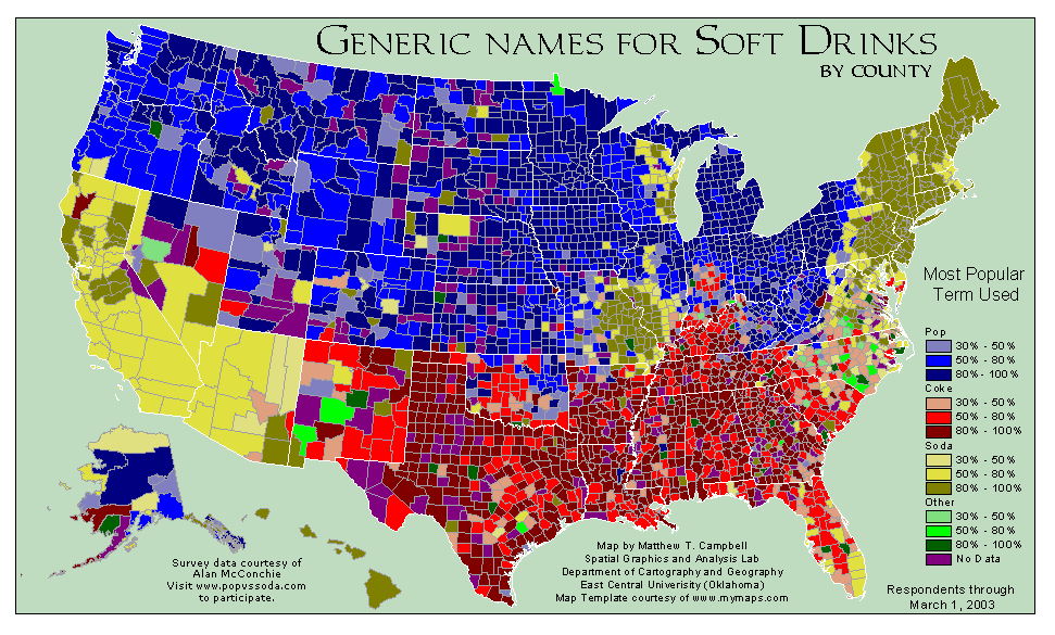
http://www.popvssoda.com/countystats/total-county.html
This map was created by Professor Greg Plumb and Matthew Campbell from East Central University in Oklahoma to show how soft drinks are called in different parts of the United States. The map shows each county in the country and their preferred term for soft drinks. Apparently, there are three main terms used: pop, coke, and soda. I find it very interesting to see how different locations in the U.S. have different terms for soft drinks. Here in California, I hardly ever hear pop, I didn't even know it was still commonly used. What's also interesting is how the Midwest uses almost exclusively the word pop and the south uses coke, yet both coasts mainly use soda.

http://2.bp.blogspot.com/-hZdthji1N8k/TlkMb0qKzKI/AAAAAAAAAsA/dOqwHk51tOk/s1600/world-map-of-social-networks-large.jpg
This map was created by Google trends for websites. It depicts the world and what social networks are used in different countries. Eleven social networking sites are shown in this map, with Facebook being the most widespread. What's interesting about this map is just how widespread Facebook is. Facebook truly is a global phenomenon, with countries in each continent using it. Also, I have never even heard of the other social networking sites, and all of them are mainly used in their country of origin.
Subscribe to:
Comments (Atom)